The Brief
Range Is The Pitch,
Chaos Is The Risk
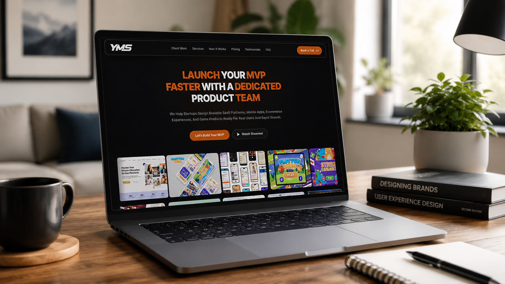
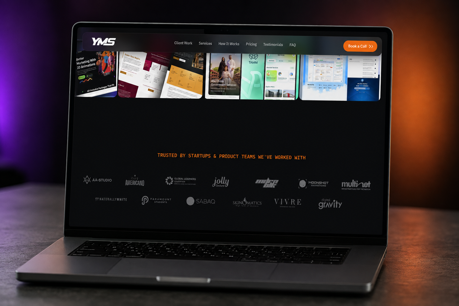
A studio that builds education platforms, mobile games, and ecommerce apps for other founders needs its
own site to prove that range — without looking like five different portfolios stapled together.
The system had to flex hard enough to hold wildly different client work, and stay disciplined enough
that it still felt like one studio, one voice.
- A single grid system flexible enough to hold a SaaS dashboard next to a mobile game
- One clear headline claim instead of a client-by-client pitch
- A direct path from hero to "Let's Build Your MVP," with a showreel as the secondary option