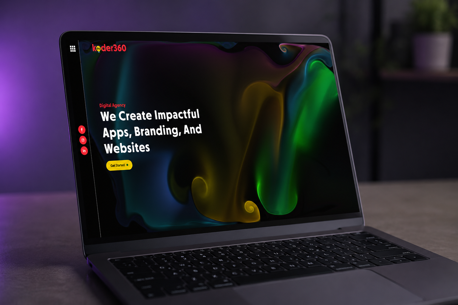
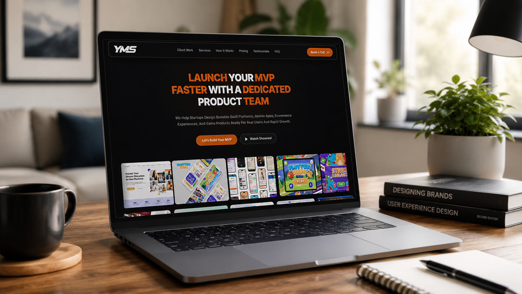
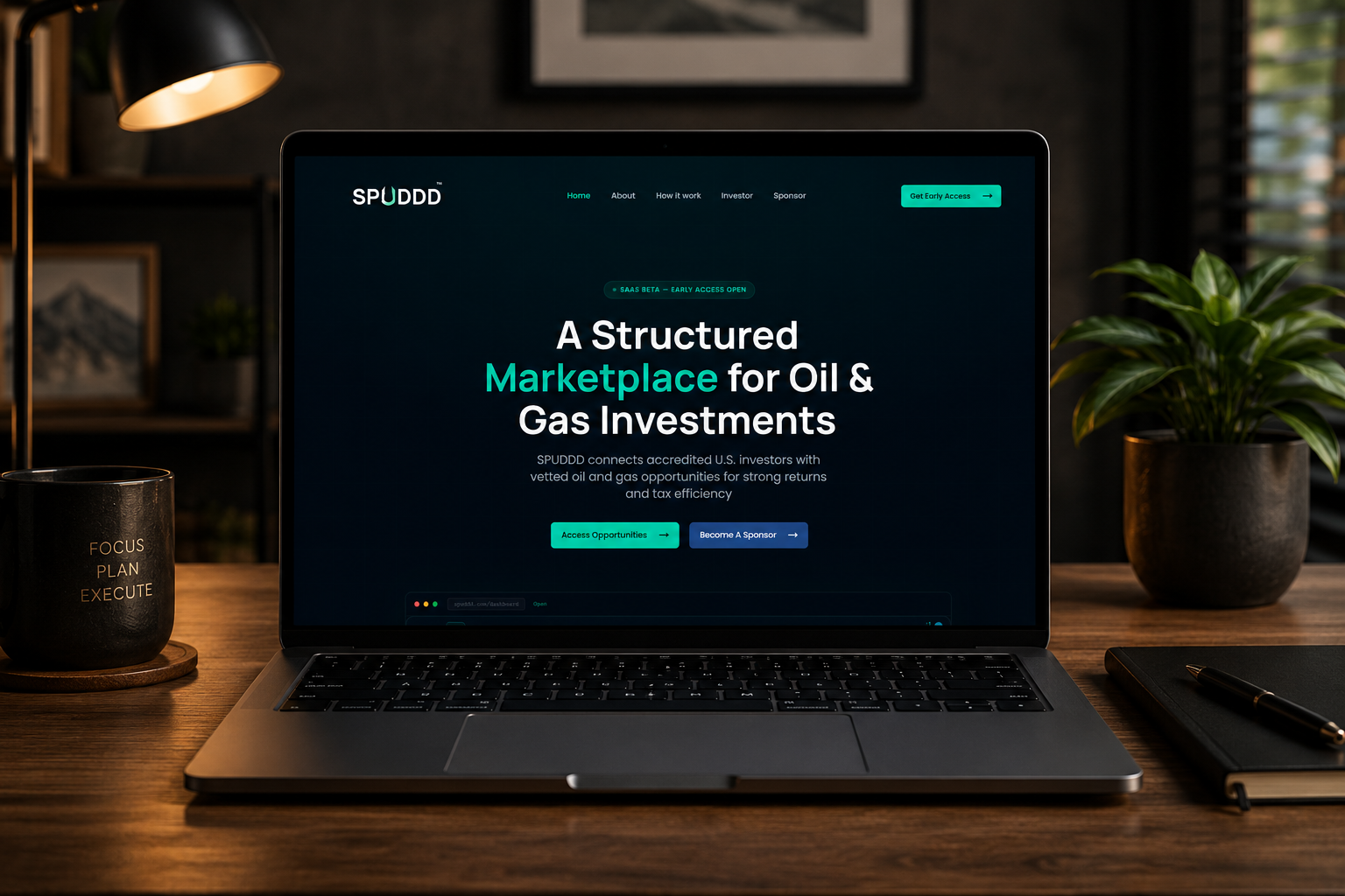
Koder360 sells web, app, and marketing services — which means their own site is judged on craft before a single word is read. We built a dark, aurora-lit system confident enough to make that case on its own.
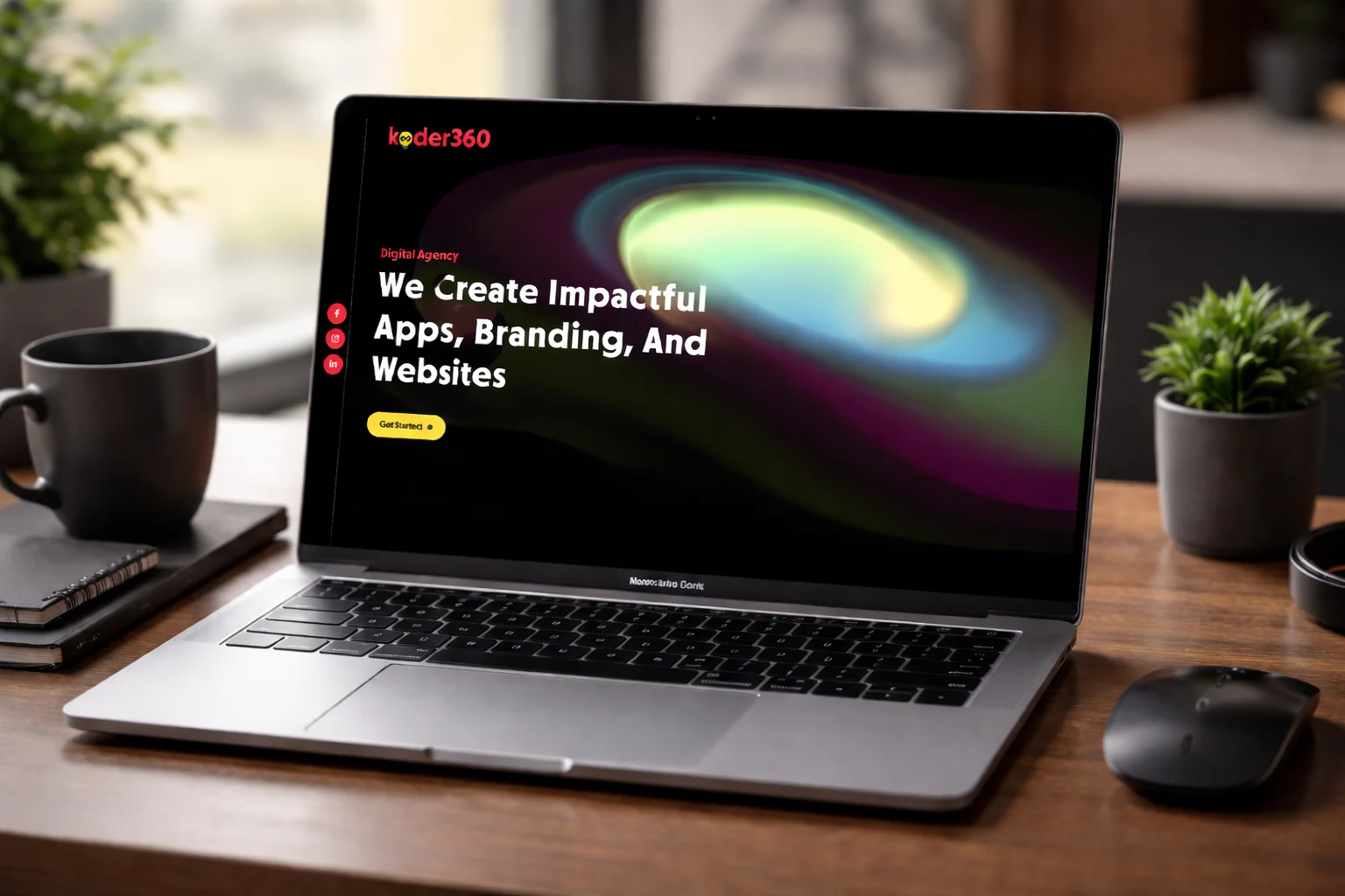
Anyone can write "we build beautiful websites." An agency's own site is the one place that claim gets tested instantly — visitors decide whether to trust Koder360 with their brand before they finish scrolling the hero.
The brief wasn't a feature list. It was one question: what does a site have to do, visually, to earn the right to pitch design services at all?
An agency site has to prove the agency can design — before it says a word.
The hero carries a full-bleed animated aurora gradient — the site's signature visual moment — set against near-black to make the color impossible to ignore. Everything else stays quiet by comparison.
Red and black do the branding. A single yellow accent does the converting — reserved entirely for the call to action, so there's never a moment of doubt about what to click.
Every section demonstrates a design decision instead of describing one — the strongest pitch an agency can make.
A single, consistent accent color cuts through a page built to impress — the CTA is never in competition with itself.
Components and motion patterns built once, ready to extend as Koder360's own portfolio of work expands.
We'll build you a system as confident as the work it's selling.